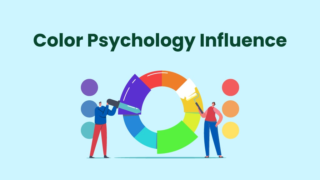
When you browse a website, have you ever noticed how certain colors make you feel more excited or relaxed? This intriguing phenomenon is known as color psychology, and it plays a crucial role in web design.
Imagine walking into a store where everything is painted in dull gray with harsh lighting. It wouldn’t feel welcoming, right? Now, picture a store filled with soft pastels or vibrant, cheerful hues—suddenly, the atmosphere feels inviting, lively, and engaging.
Just like in physical spaces, the colors on a website shape how users perceive, interact, and engage with content. The right color choices can boost conversions, enhance readability, and reinforce brand identity, while the wrong choices can cause users to leave a site within seconds.
In this article, we’ll explore how color psychology affects web design, the emotional impact of colors, how to create an effective color palette, and how brands use color to increase engagement and conversions.
What is Color Psychology in Web Design?

Color psychology is the study of how colors influence emotions, behaviors, and decisions. It’s no coincidence that red is associated with urgency, blue builds trust, and green promotes nature and calmness. These color associations are deeply ingrained in human psychology due to cultural influences, personal experiences, and biological responses.
Why Do Colors Matter in Web Design?
When choosing the right color scheme, web designers must go beyond aesthetics. Colors play a crucial role in:
User Engagement: The right colors hold a visitor’s attention and keep them exploring the site.
Conversion Rates: Strategic color placement can encourage users to take action (like clicking a button).
Brand Recognition: Consistent use of colors reinforces brand identity and boosts recall.
Emotional Triggers: Colors can create a specific mood or reaction, influencing decision-making.
By understanding and applying these color principles, designers craft user-friendly websites that drive results.
Common Color Associations in Web Design
Have you ever wondered why Facebook is blue, McDonald’s uses red and yellow, or luxury brands prefer black and gold? These choices aren’t random. Brands carefully select colors to evoke specific emotions and influence consumer behavior.
What Different Colors Represent in Web Design?
In web design, the right color can build trust, create urgency, or drive engagement, while the wrong one can turn visitors away. Let’s break down what different colors mean and how they shape user perception.
Red: Passion, urgency, excitement, power (e.g., McDonald’s, YouTube)
Blue: Trust, reliability, security (e.g., Facebook, LinkedIn)
Yellow: Happiness, energy, optimism, creativity (e.g., Snapchat, IKEA)
Green: Growth, tranquility, eco-friendliness, trust (e.g., Whole Foods, Starbucks)
Purple: Luxury, creativity, wisdom, imagination (e.g., Yahoo, Cadbury)
Black: Elegance, sophistication, authority (e.g., Chanel, Nike)
Orange: Enthusiasm, friendliness, energy
White: Simplicity, purity, cleanliness
If you are a web designer, strategically choose colors to create an emotional connection with users and guide them through the website experience.
The Role of Color in Web Design
Have you ever visited a website that just felt right? The reason might be color psychology at play. Colors don’t just make a website look good. They impact user behavior, brand perception, and readability.
For example, a spa website with neon colors wouldn’t convey the feeling of relaxation. Instead, soft blues and greens create a calming atmosphere that aligns with the business’s identity. Similarly, fast-food brands use red and yellow to stimulate appetite and energy, making customers more likely to order quickly.
Key Ways Color Influences Web Design
User Engagement – Colors affect how long users stay on a site.
Call-to-Action Effectiveness – Bold colors can drive clicks and conversions.
Readability – Poor contrast can make content difficult to read, affecting usability.
Emotional Connection – The right colors establish trust and familiarity with users.
Following these color principles, web designers create user-friendly and conversion-optimized websites.
How Color Choices Shape User Perception?
The colors used in a website’s background, buttons, and text significantly influence how users feel and behave.
Contrast & Readability
Have you ever visited a website with a dark background and neon text? It might have looked stylish, but if the contrast was too low, it was likely hard to read. Poor contrast can lead to eye strain, higher bounce rates, and lower engagement.
A well-designed website uses:
- High-contrast colors to enhance readability.
- Cohesive color schemes to maintain consistency.
- Strategic use of bold, eye-catching hues to highlight important elements (like CTAs).
For example, a bright “Buy Now” button in orange or red draws instant attention and encourages action. Meanwhile, a muted CTA may go unnoticed, reducing conversions.
Create a Meaningful Color Palette for Your Website
Designing a color scheme for a website is like choosing the perfect outfit. It needs to be visually appealing, functional, and brand-appropriate.
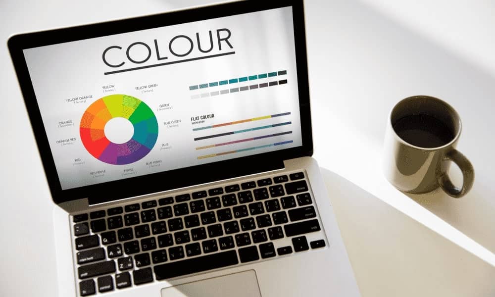
Types of Color Schemes
Monochromatic – Different shades of the same color (e.g., Apple’s minimalist gray tones)
Analogous – Colors next to each other on the color wheel (e.g., blue-green-turquoise for a serene feel)
Complementary – Opposing colors that create contrast (e.g., red and green for high impact)
Triadic – Three evenly spaced colors for vibrancy and balance (e.g., Google’s blue-red-yellow scheme)
How to Choose the Right Colors?
- Use brand colors consistently across the site for recognition.
- Limit your palette to 3-5 primary colors for cohesion.
- Test different color combinations to see what resonates with your audience.
Tools like Adobe Color, Coolors, and Paletton will help you experiment with different color combinations before implementing them.
Cultural Considerations in Color Psychology
In today’s globalized digital world, understanding cultural differences in color perception is crucial. A color that symbolizes positivity in one culture may have a negative meaning elsewhere.
Examples of Cultural Color Differences
White: Purity in Western cultures but associated with mourning in some Asian cultures.
Red: Luck and celebration in China, but warning and danger in Western contexts.
Yellow: Happiness in the U.S., but in some cultures, it symbolizes deceit.
Consider cultural interpretations so that brands can avoid misunderstandings and ensure their website resonates across diverse audiences.
How Color Psychology in Web Design Boosts Conversions?
So, how do you choose the best colors to boost engagement and drive sales? Let’s break down the science behind conversion-focused color psychology in web design.
How Colors Influence Purchase Behavior?
Red & Orange – Create urgency and encourage impulse buying.
Blue & Green – Build trust, making them ideal for finance and healthcare websites.
Black & Gold – Evoke a sense of luxury and exclusivity.
Call-to-Action (CTA) Color Psychology
A well-placed, high-contrast CTA can increase conversions by over 20%.
Red = Urgency (Limited-time offers)
Green = Confirmation (Proceed to checkout)
Yellow = Attention-grabbing (Subscribe now)
A/B testing different colors helps determine which CTA colors work best for conversion optimization.
Final Thoughts
Color psychology is not just a theory—it’s a powerful tool that web designers can use to create visually appealing, emotionally engaging, and conversion-driven websites.
By carefully selecting colors, considering cultural factors, and testing user reactions, businesses can maximize user engagement, enhance brand perception, and drive more conversions.
So next time you browse the web, pay attention to the colors used—you might just notice how they influence your emotions and decisions!
Want to create a visually stunning, high-converting website that captivates your audience? Supreox helps businesses harness the power of color psychology and cutting-edge web design to maximize engagement, build trust, and drive sales.
FAQs on Color Psychology in Web Design
What is the best color for a CTA button?
The best color for a Call-to-Action (CTA) button depends on your website’s goal, audience, and industry. However, research shows that red, green, and orange are some of the most effective colors for CTAs because they grab attention and encourage action.
How many colors should I use in my website design?
To maintain a clean, professional, and visually appealing design, it’s best to stick to 3-5 primary colors. Using too many colors can make your website look cluttered and overwhelming, while too few can make it appear bland and uninspiring.
Does color impact website engagement?
Absolutely! Studies show that up to 90% of first impressions are based on color alone. This means that before a visitor reads a single word on your website, their subconscious mind has already formed an opinion based on the colors they see.
What are the most trustworthy colors for business websites?
If you want your website to appear professional, credible, and reliable, blue and green are the best choices.
How can I test which colors work best?
The most effective way to determine the best color choices for your website is through A/B testing. This allows you to compare different color schemes and CTA button colors to see which ones drive the most engagement and conversions.